Accessibility in social media

Social media plays a huge part in our day-to-day lives. It’s used by people from all walks of life. But are your social posts accessible to everyone? Would you know where to start if someone from your c-suite said that you needed to implement a more accessible approach to your social strategy? In this blog post, we’ll outline what accessibility within the realm of social media is and why you should implement it into your social media strategy.
What is accessibility and why is it important?
Accessibility, at its core, is all about people. People access content and services in very different ways, because people are very different. Some rely on assistive technology to use social media, which is exactly who social media accessibility is intended for. This includes people who are blind or visually impaired, deaf or hard of hearing, people with dyslexia or cognitive learning disabilities, or neurodivergent people. They should be able to “access” your content as effectively as someone without a disability.
Thinking about these people is important. Otherwise, you’d be neglecting a huge part of your audience and in turn, missing out on a bunch of engagement and SEO opportunities as well. Hopefully, if you take one thing away from this post, it’s to remember to not make assumptions about the audience coming to consume your content.
If you were to take and honest look at your own social media. How accessible are your posts right now?
Where to start?
You may well be thinking: Yes, I know I need to get better at this, but I’m not sure where to start. Well, let’s get into it, shall we!
Image accessibility
Images do really well on social media. That’s why a lot of companies are focused on adding beautiful visuals and photos to their posts. And the adage of “a picture can say a thousand words” may work for someone with 20/20 vision, but as we’ve discussed before, that’s not everyone. Your message could get lost if you don’t use enough contrast in your visuals, or colors that easily blur together.
There are specific challenges that come with color and contrast. For example, you shouldn’t rely on color alone to convey a message. So let’s take a closer look at this.
Label your information
For someone who is colorblind, the key information in this chart may be lost, or its meaning may change. This image relies on the user being able to see red versus green. And to understand that “green” is good and takes up more than half of the chart in this context.
This also relies on a cultural context of red being negative and green being positive, which is not as universal as you think. Nor is it very inclusive of everyone’s needs. How can we fix this?
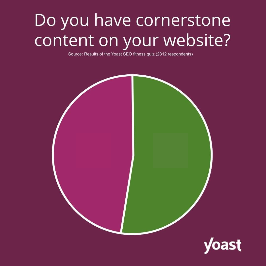
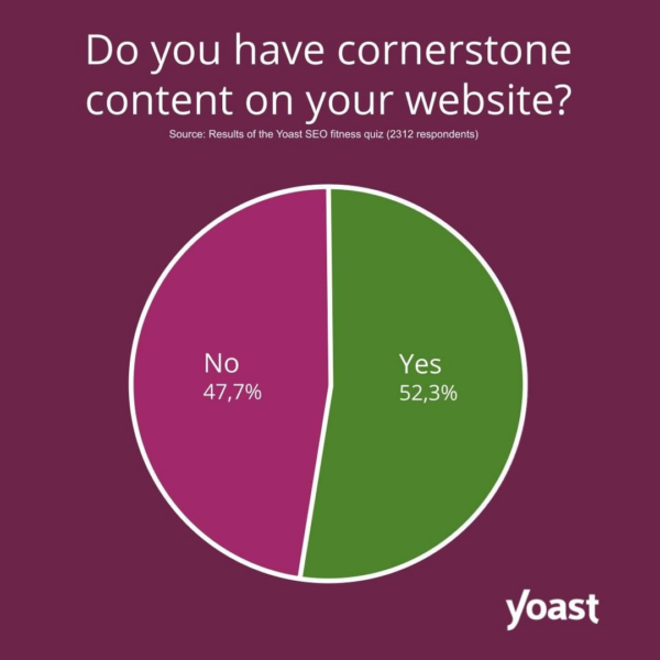
To make this chart more accessible, we need to label the key information that we want to get across. If the information is not there, people can’t engage.
Adding some labels to the chart makes it much easier to understand the message we’re trying to get across.
This also benefits people who are skimming past your posts. All the information is there at a glance!
Contrast in your images
Not only do you need to make sure that you’re labeling the information you want to convey, you also need to think about the colors you use and their relationship to each other. It’s wrong to assume that everyone sees images the same way as a person with 20/20 vision. But thinking about contrast can help.
Let’s look at an example.
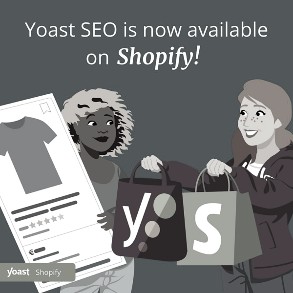
To illustrate how some people might experience graphics, we’ve taken most of the color out of this image. See how you can still identify the key parts and the message still makes sense? It’s not perfect, though. The contrast near Holly’s leg – the woman on the right – is not great.
There are a number of tools that you can use to check the contrast ratios. For example, Contrast Ratio is easy to read and has an easily understandable traffic light system (which is why we like it so much!). Another great tool is Tanaguru Contrast-Finder. Tanaguru allows you to go a bit more in depth.
There are even more guidelines and tools that you can use to ensure that the contrast ratio of your text and graphics is sufficient against the background. We highly encourage you to explore these different tools! If you use text, however, do note that there are minimum contrast ratios based on the font sizes.
Image alt text
Having text in your images is one of the easiest ways to get your message across. However, that text is inaccessible to screen readers. So, it’s best practice to include alt text and even caption your images. Because both alt text and captions can be read aloud by assistive technologies.
Images falls into one of three different categories: informative, functional and decorative. You can read more about this on the W3C website. Decorative don’t need an alt text. But informative images do. If you post an image on social media with the purpose of conveying information, you should always try to include an alt text that describes the image and what is in it. There are a few best practices to keep in mind when writing an alt text. Write proper sentences and keep it short. Generally, 125 – 140 characters is the way to go. That’s effectively a short tweet!
Each of the social platforms handles alt texts in different ways, which can be confusing. The platforms are getting better at making people aware of the functionalities they have, but it could be better. We will show you how to find the alt text, but first let’s look at some examples of what you should be writing. We’ll use the same example image as before:
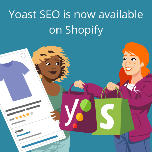
You could start by simply repeating the text that is in the image. Simple is better than nothing, after all!
Yoast SEO is now available for Shopify
This is fine, but it could be better. We’re missing context, after all. So keeping in mind the image above, let’s add some context to the alt text.
The phrase "Yoast SEO is now available for Shopify" above an illustration of two women shopping
Do you see how adding more contexts builds the image in your mind? There is still a lot more we could do, though. Let’s take it one step further.
The phrase "Yoast SEO is now available for Shopify" above an illustration of two women. One holds shopping bags with the Yoast and Shopify logos, and the other holds an example of a search result.
This gives a much clearer description of what the image looks like. Plus, it provides context to the copy that is posted with it.
Of course, you could improve these even further. Just don’t go overboard by describing everything. And don’t worry about getting it wrong. Writing alt text is as much of an art as it is a science. And writing something basic is still better than nothing. If you need more help or inspiration, we encourage you to watch this video from the delightful Jake and Surma about alt text. Don’t worry, we’ll wait.
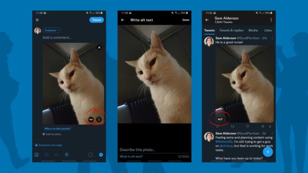
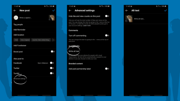
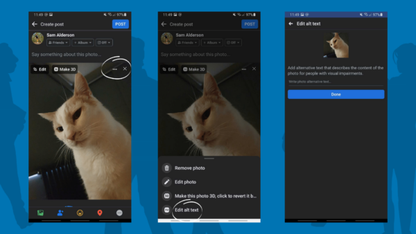
Great! We now know what we should be writing. But where do we input this on the platforms? Below, you’ll find some screenshots of Sam’s cat Patch. It’s worth noting that we used an android for these screenshots, so things might look different on an iPhone.
After you have composed your tweet like normal, look at the bottom right of the image. You’ll see an ALT button. Here, you can write your description and save it. Once saved, it will then show that your tweet has an alt attribute. This has to be done before you tweet, since you cannot edit anything after the fact.
On Instagram, these setting are hidden in the advanced settings, so you’ll need to do a bit of digging. Instagram does allow you to alter the alt text after posting. So, if you forgot to add an alt text, you can nip back in and still include it.
On Facebook, they have an AI that can add alt text for you. But AI alt attributes are rarely good. They do a reasonable job of identifying what’s in the picture, but they lack your context. That’s why it’s better to practice writing an alt text yourself.
Video accessibility
Videos, especially short-form video, are only getting more popular, and this trend will likely continue to grow. For example, Facebook even added its version of TikTok to the home feed, because video is so popular! But did you know that over 80% of videos on Facebook are watched without sound? Raise your hand if you do this too!
There is a lot to consider when dealing with videos in terms of accessibility. One of the easier things you can do is add captions or subtitles. These terms are used interchangeably on social media, but they are used for specific reasons. Do you know the difference? Let’s go over them.
Closed captions
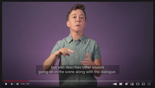
- Convey all the essential audio: dialogue, music, sound effects, and audio cues.
- Intended for audiences who cannot hear the audio.
Subtitles
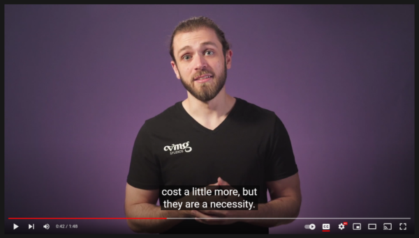
- Convey the dialogue only.
- Intended for audiences who can hear but not understand the audio – think translations.
Including these is a great starting point for making your videos more accessible. If you’re still not sure which you should be using, this video – Closed Captioning vs. Subtitles: What’s The Difference? – is really helpful.
Open or closed captions?
What’s the difference? The short answer: closed captions can be turned on and off. But open captions are actually part of the video, so they can’t be turned off. It’s up to you which you want to include. Whichever you choose, you will give your followers the choice of how they want to consume your content on social media: with sound or without.
Transcripts
Transcripts are an outstanding resource to utilize! Not only do they describe the dialogue of a video, but they also describe the sounds and visuals. Not to mention, they provide your followers with a choice in how they consume your video content.
And there’s more good news. Transcripts can also be formatted in a way that is SEO-friendly, and they give you the opportunity to link to other pages and resources. For inspiration, our blog team did a fantastic job for this podcast on user experience. YouTube can create transcripts automatically, but you do need to review them as the tool doesn’t work perfectly.
If writing transcripts feels overwhelming, we encourage you to head over to W3C. They have a great resource for how to handle transcripts.
Better captioning tools on social media
The platforms are starting to take social media accessibility more seriously by adding tools to make your videos more accessible. Some, like TikTok, generate subtitles automatically. These may not always be perfect, but it’s a good starting point. Instagram has also started adding captions to muted videos in your feed.
Other accessibility considerations
Though we have discussed a bunch of important topics already, there are still a few other things to consider when it comes to social media accessibility. So, buckle up!
Emojis
Did you know that emojis have their own Unicode description? This description is what gets read out loud when people use screen readers. There isn’t necessarily anything wrong with using emojis, but they do get abused sometimes. Especially from an accessibility point of view. Let’s look at an example. You may remember the infamous red flag trend that was everywhere.
Screen readers read the emoji description out loud, and there is currently no way to skip this. So, you can imagine how the tweet above might’ve sounded. “I’m not on Twitter” triangular flag triangular triangular flag triangular flag triangular flag triangul… etc.
While emojis are fun, make sure you use them towards the end of your copy. If they are in between sentences, make sure they have context. Ask yourself, does the emoji description make sense in this copy? 🤔
Tip: If you want to know a specific emoji’s description, we recommend looking it up on Emojipedia.
#Hashtags
Since the creation of the hashtag (thank you, Chris Messina) they have been used in a number of different ways. When it comes to social media accessibility, it’s best practice to use CamelCase hashtags and capitalize the initial letter of each word in a phrase. This indicates to screen readers to properly read the text in the hashtag. It also makes them easier to read for the rest of the population.
For example, instead of #seoforeveryone, you may write #SEOForEveryone. It’s also worth noting that acronyms and initialism like SEO should always be capitalized. But you knew that already, right?
Custom fonts
Twitter particularly seems to go through phases of using custom fonts to seem cute. Unfortunately, they are not accessibility-friendly. Have a look at this tweet from Kent. It’s a fantastic example of what a tweet with custom fonts sounds like for a person with a screen reader.
Not fun, right?
Conclusion
Social media accessibility helps you open up your content to a wider audience, with the added benefit of giving other followers different ways to consume your content. With just a few tweaks to your workflow, you could see an increase in engagement.
We at Yoast are very passionate about accessibility. Not only for social media, but also for the web in general. That’s why we encourage you to look at what others are doing, and how social media platforms are putting features in place to make accessibility even easier. For example, there are now companies out there that have included tools in their scheduling software. Amazing, right?


Discussion (2)